Visual Design
Project 2
Project 2 - Branding & logo design for Invivify
Project Overview
I was approached by a client, who wanted to create a company which specialises in providing resume writing services, to design their branding, name and logo. Today, Invivify is an established Australian-based Resume Writing, Cover Letter and LinkedIn Optimisation organisation.
Brief
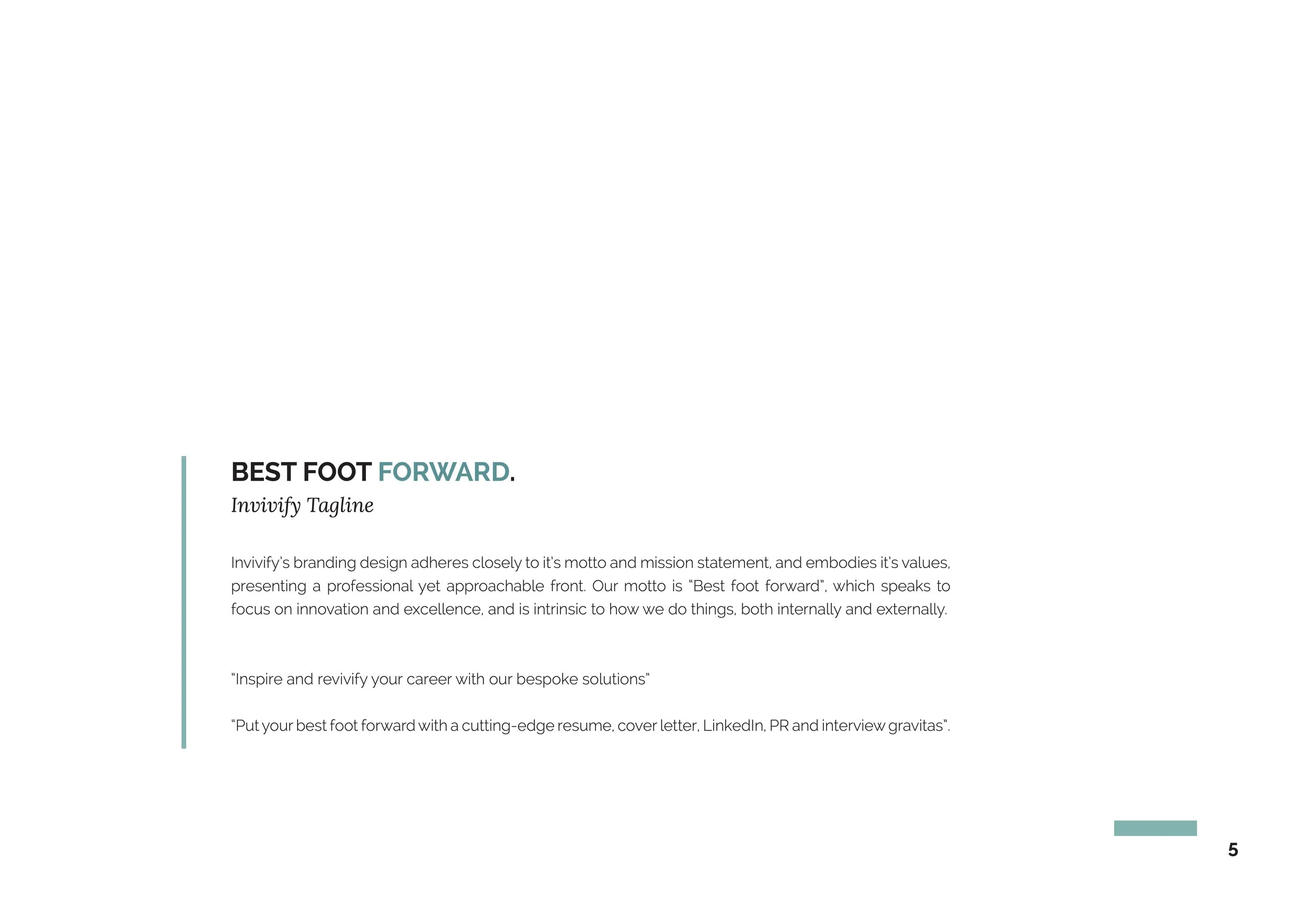
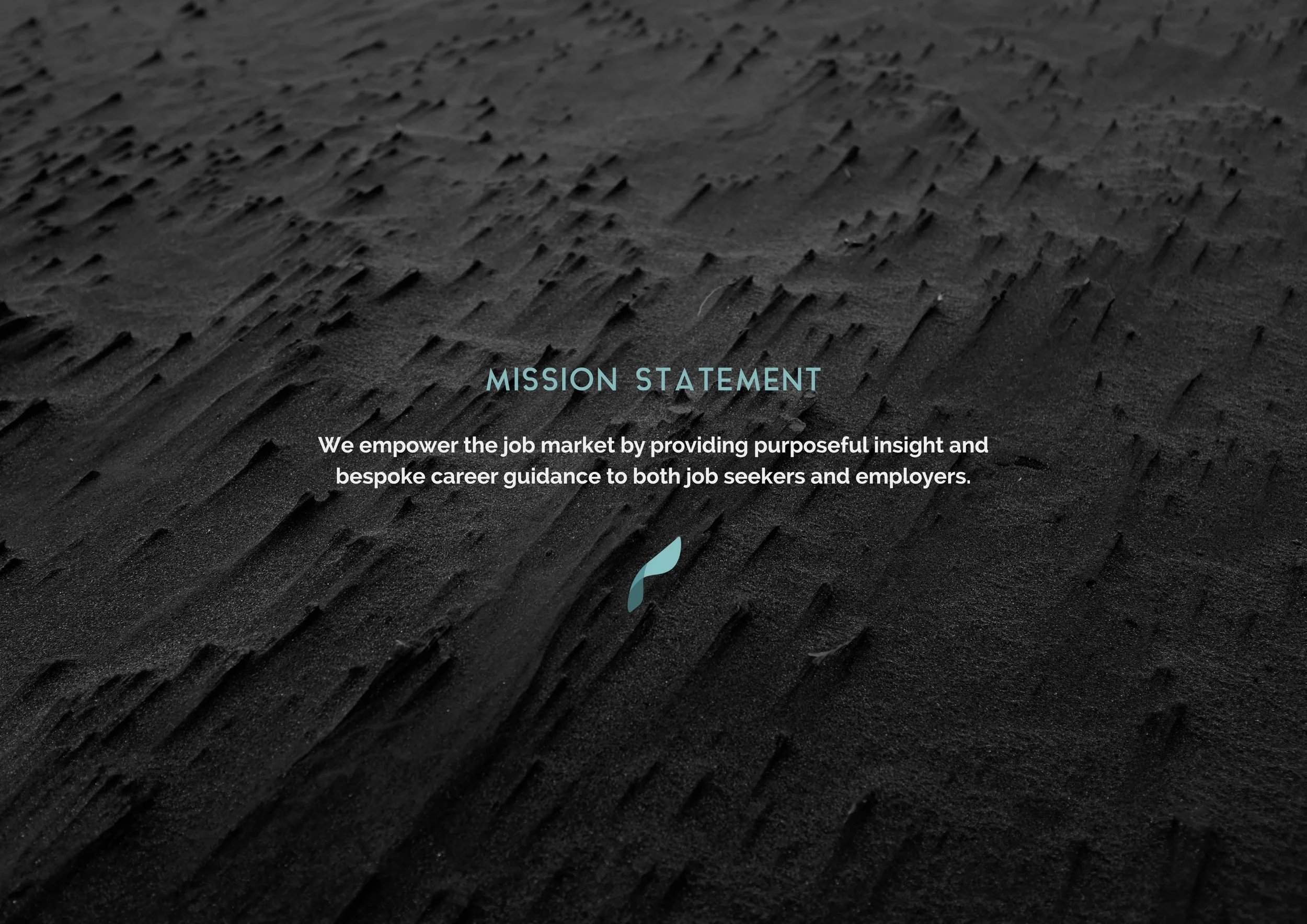
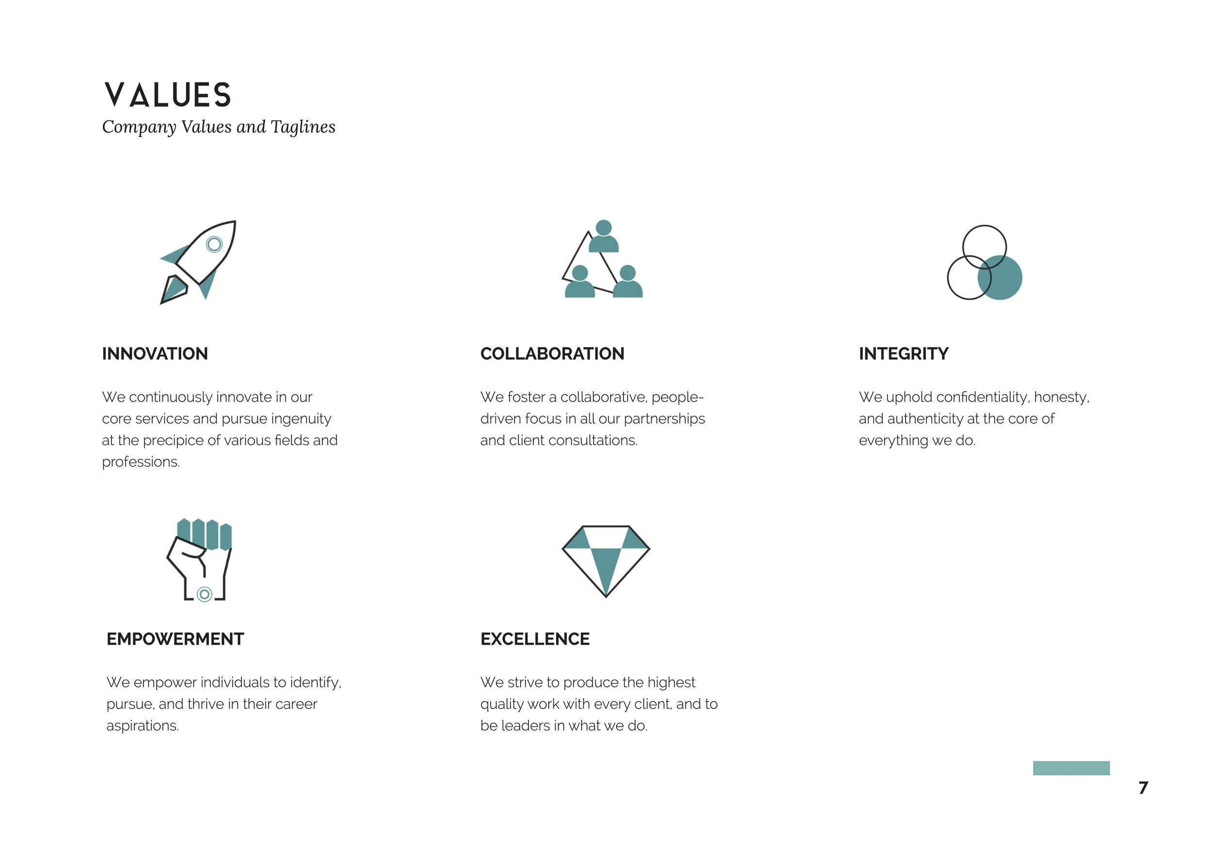
Values and mission statement
Helping the team define their company values and their mission statement based off the company owner’s vision.
Logo Design
Designing a succinct logo which best captures company values, vision, and the services provided.
Branding design - Visual Style Guide
Designing company’s brand and creating an extensive guide for employees and future designers.
Business Card Design
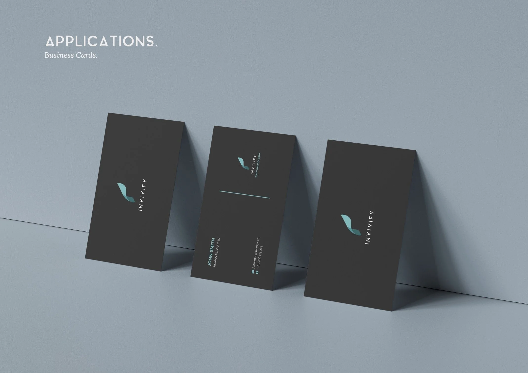
Designing business cards for current employees and liaising with printing company for top quality production.
Design Consulting
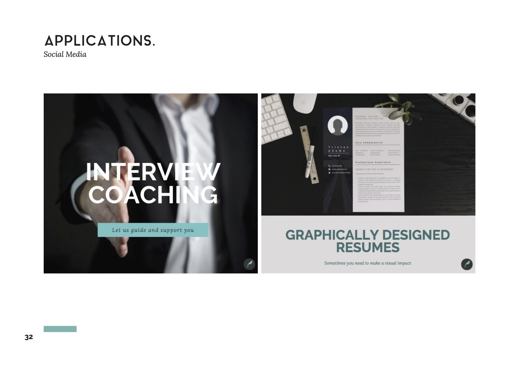
Provide consulting and necessary materials for the development of Invivify’s website and social media posts.
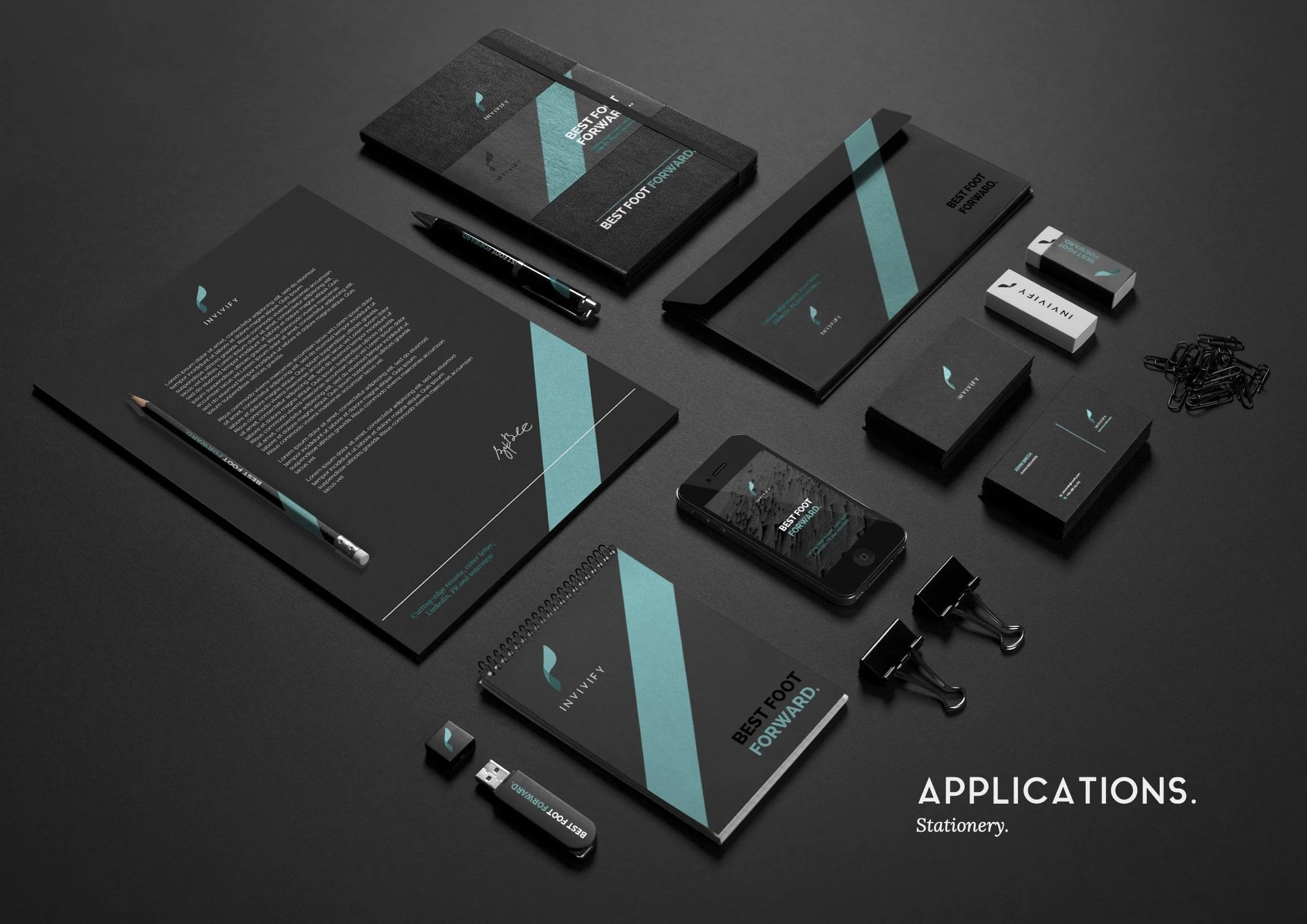
Other Materials
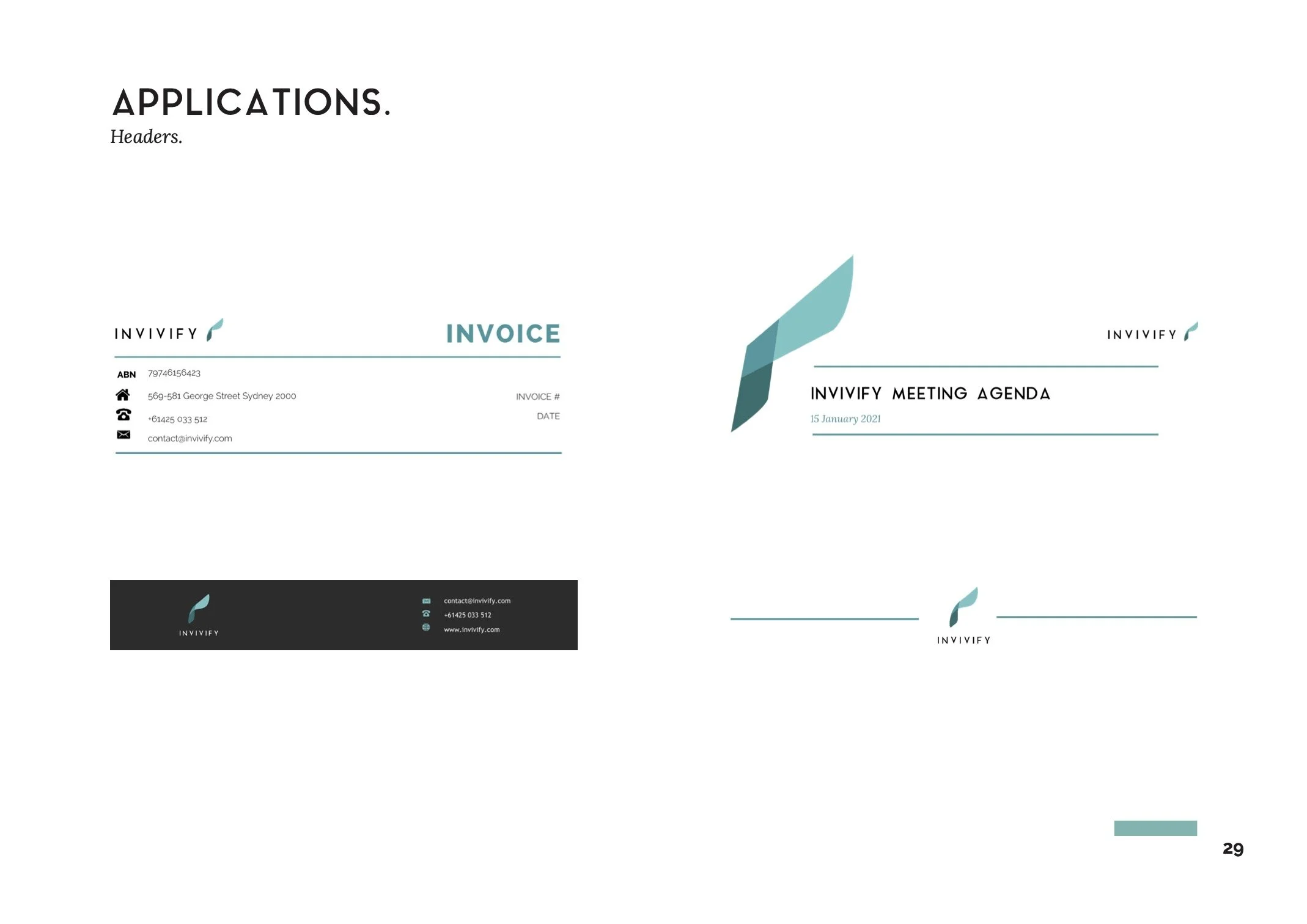
Designing other necessary documents such as invoices, headers and social media banners.
My Approach
Market Research
The first step I took was to research their current competitors to understand more about the market, and communicating with the client to understand what he wanted. Here are some of the top competitors’ websites that we looked at:
What does Invivify Mean? - Team Brainstorm
Next, I facilitated a team brainstorm and discussion to understand what the name “Invivify” evokes, and how they want their company to be perceived.
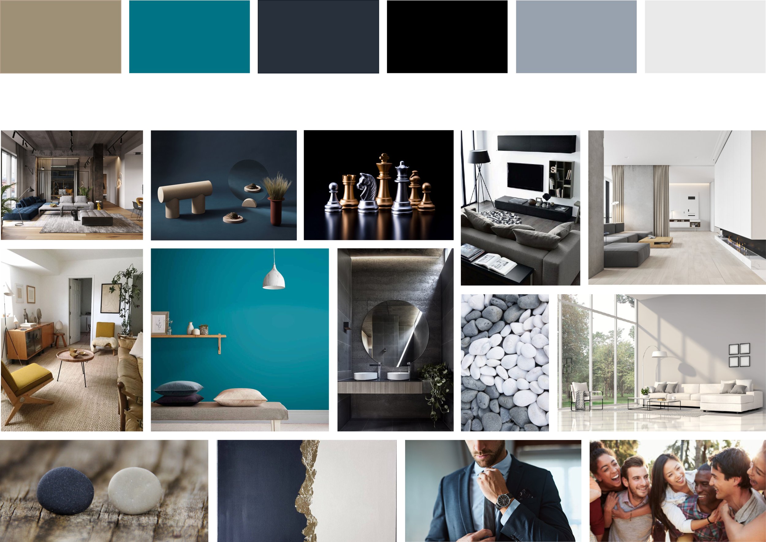
Moodboard
A mood-board was then created to communicate to the client my understanding of his desired image for his brand, and to bring his vision one step closer to life.
Logo Design
I started the process with a series of sketches which were inspired by the brainstorm and moodboard. Several were then selected and shown to the team for feedback, until a final shape was chosen and settled on for revision.
Logo Ideation
-

Final logo was inspired by a plant, a universal symbol for “growth” - which was a word that came up in our brainstorm
-

One particular leaf stood out to me and I tried to capture it's silhouette with a simple continuous stroke
-

I played around with the colours blues and greens as requested by the client - The team settled on teal
-

Inspired by paypal's overlapping element in its logo, we decided to incorporate the concept into our logo design to add that extra dimension
-

An extra stroke was added to create the overlapping area, and overall the shape was rounded out to create a more defined logo
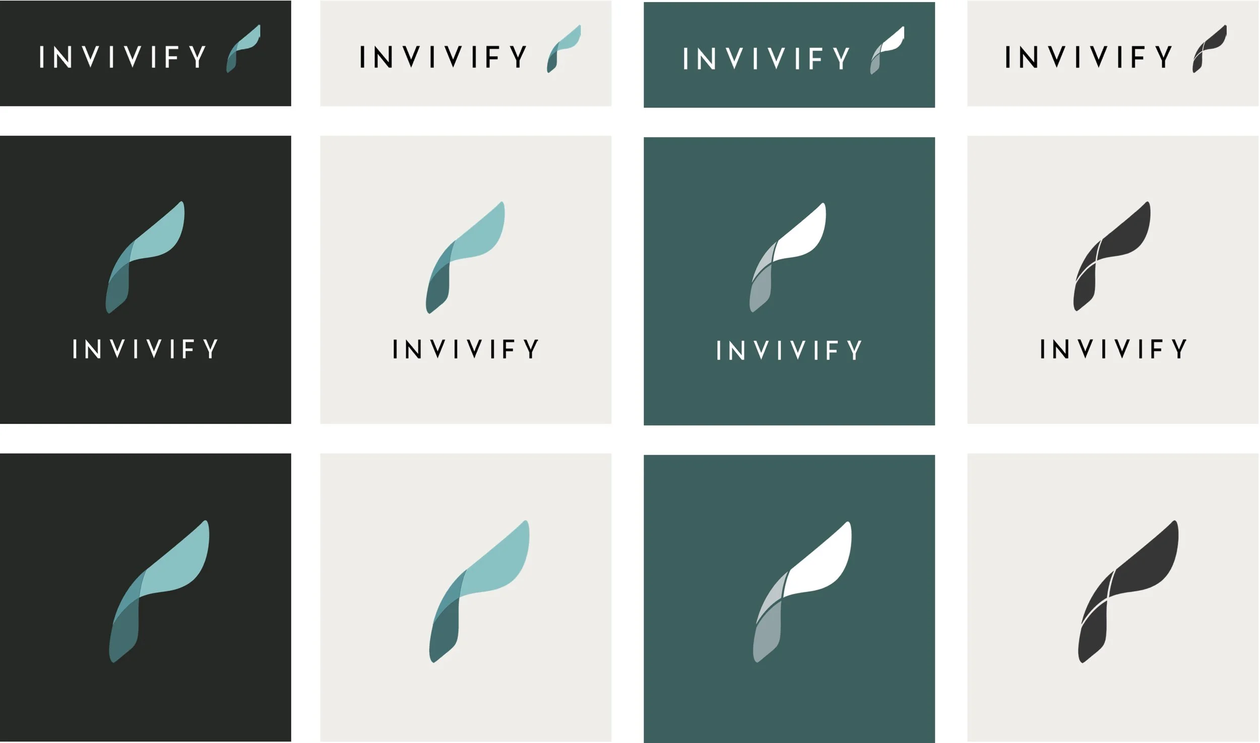
Colours and Variations
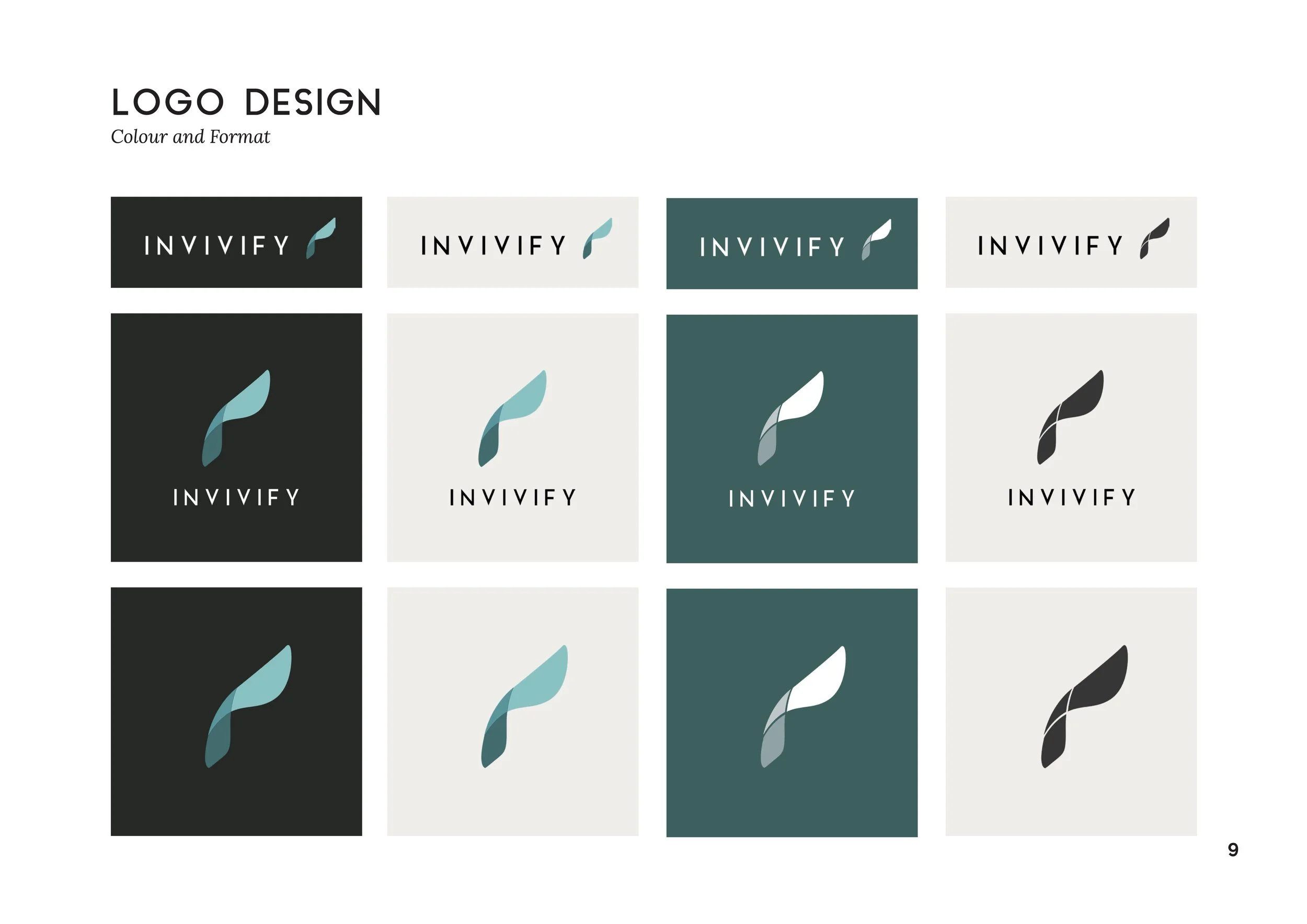
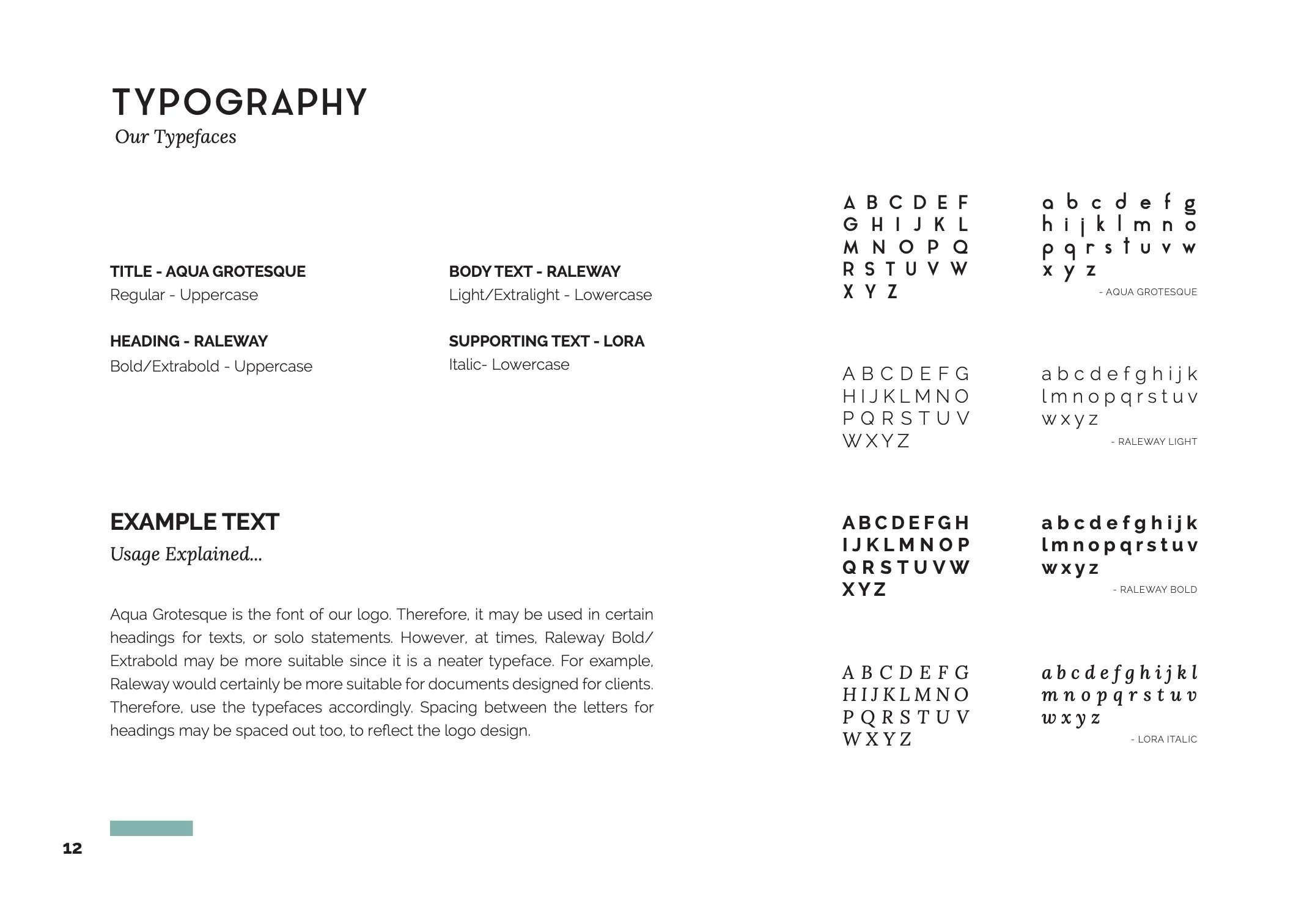
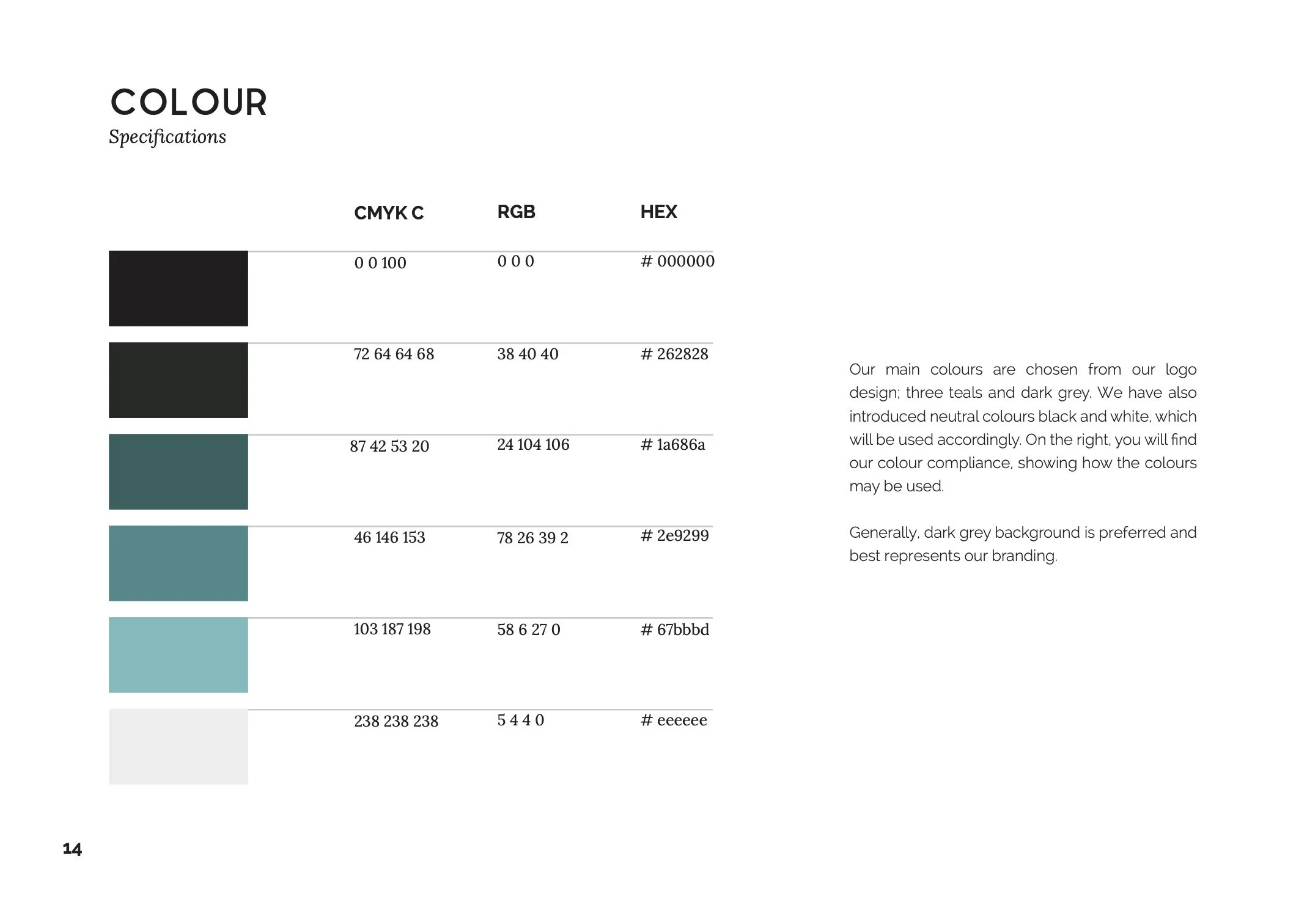
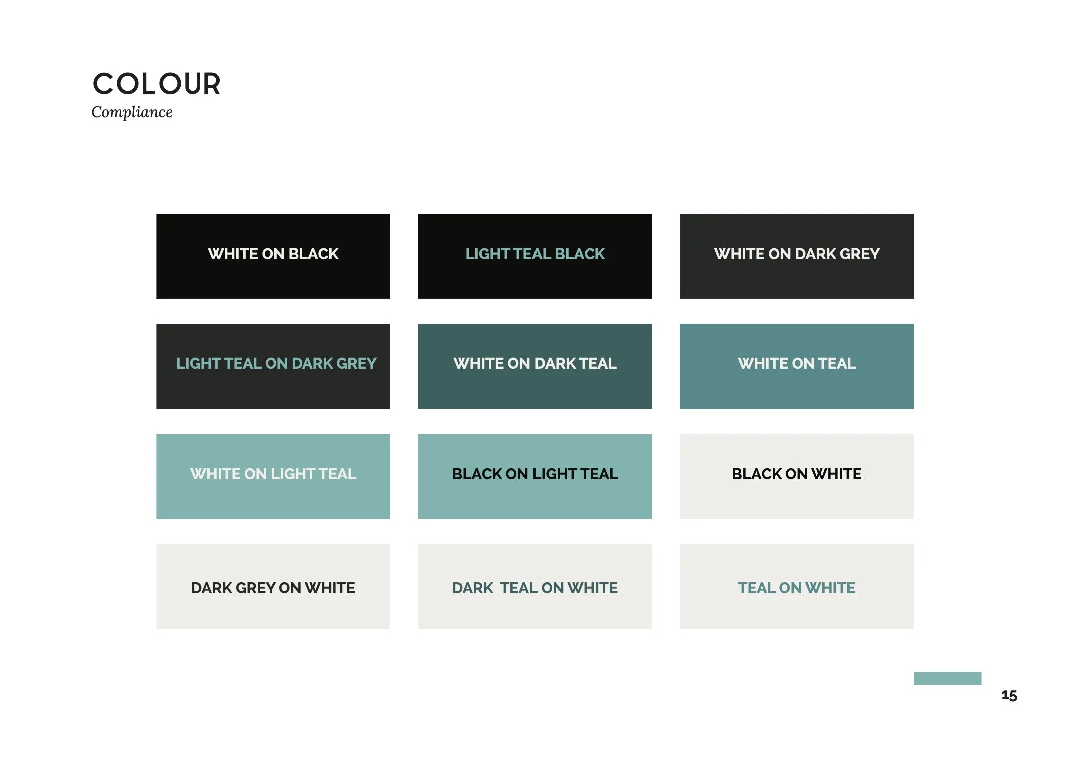
Once brand colours were finalised, I created several variations for logo to be utilised, depending on the colour and design of the materials.
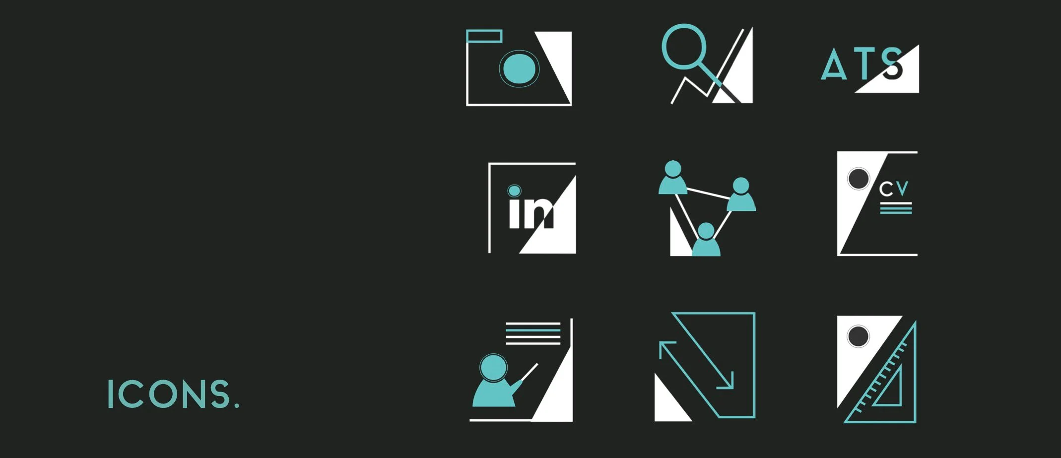
Iconography
Icons were created for the website, and were designed to emulate the sharpness of the typography in the logo, and overall brand image. Common elements which binds these icons together are the common geometry (triangles, and circles), colour and the amount of detail.
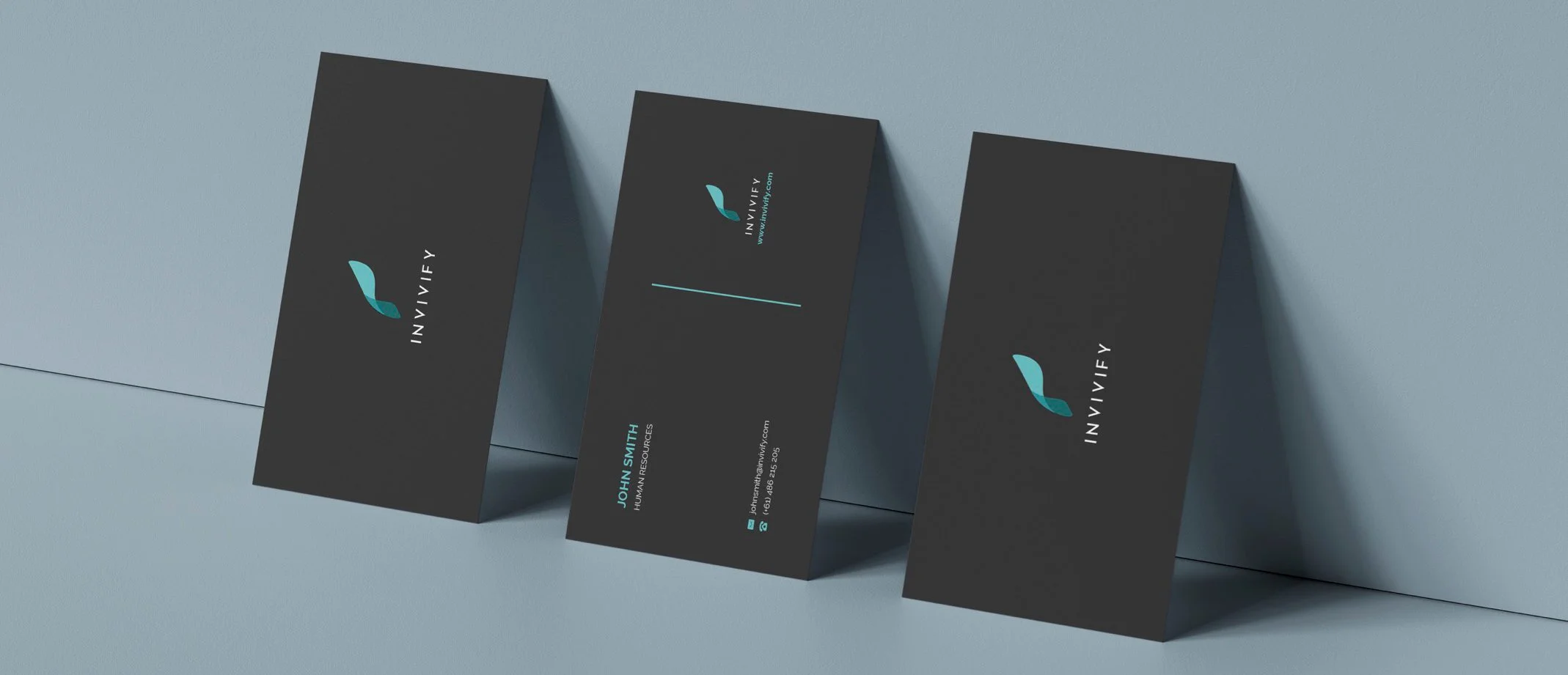
Other Materials
Invivify’s business cards.


